We already talked about kitchen renovations, but what about the interior design common rules? We all heard about these interior design rules that should be not broken, but are they really trustworthy and necessary? Let’s analyze some of them to see where lies the truth.
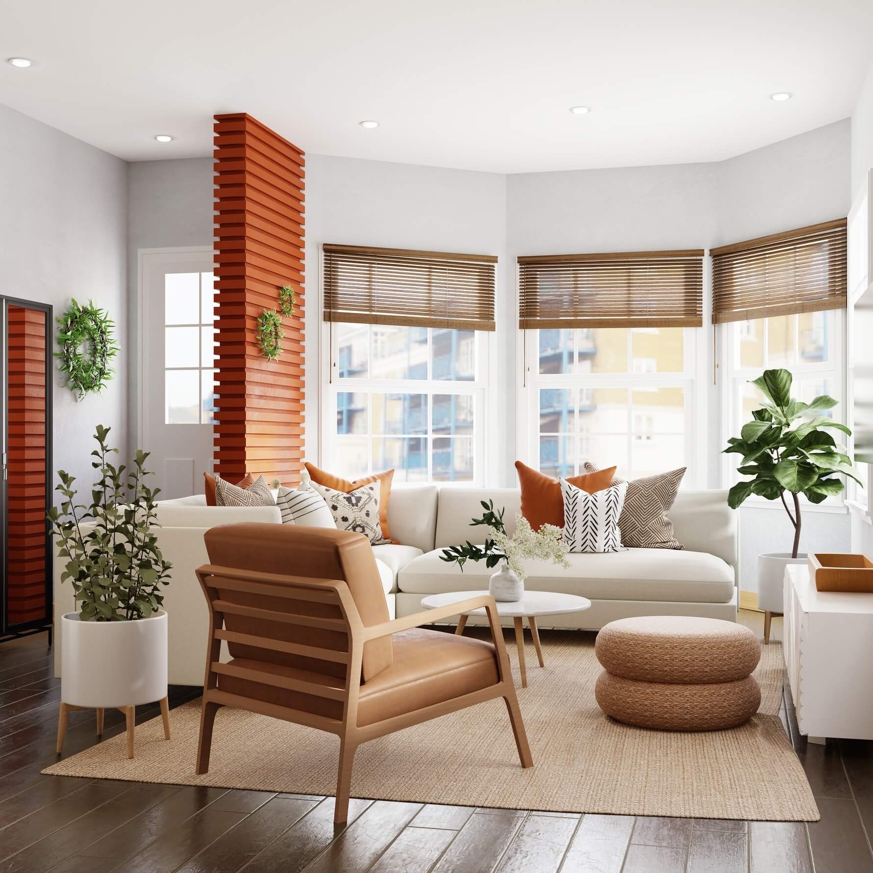
Modest footage needs light walls
Light colors visually increase the space. We trust this simple truth as the statement that the sun rises in the east. It’s not that this technique doesn’t work, but it ceases to be dogma in design projects.
When choosing exceptionally light shades, you need to keep in mind that, instead of pushing the walls apart and “letting in the air”, you can achieve the cold sterility of the dental office. Light walls in the interior work well only in tandem with an abundance of natural light. The less sun enters the room, the duller the pale walls will be.
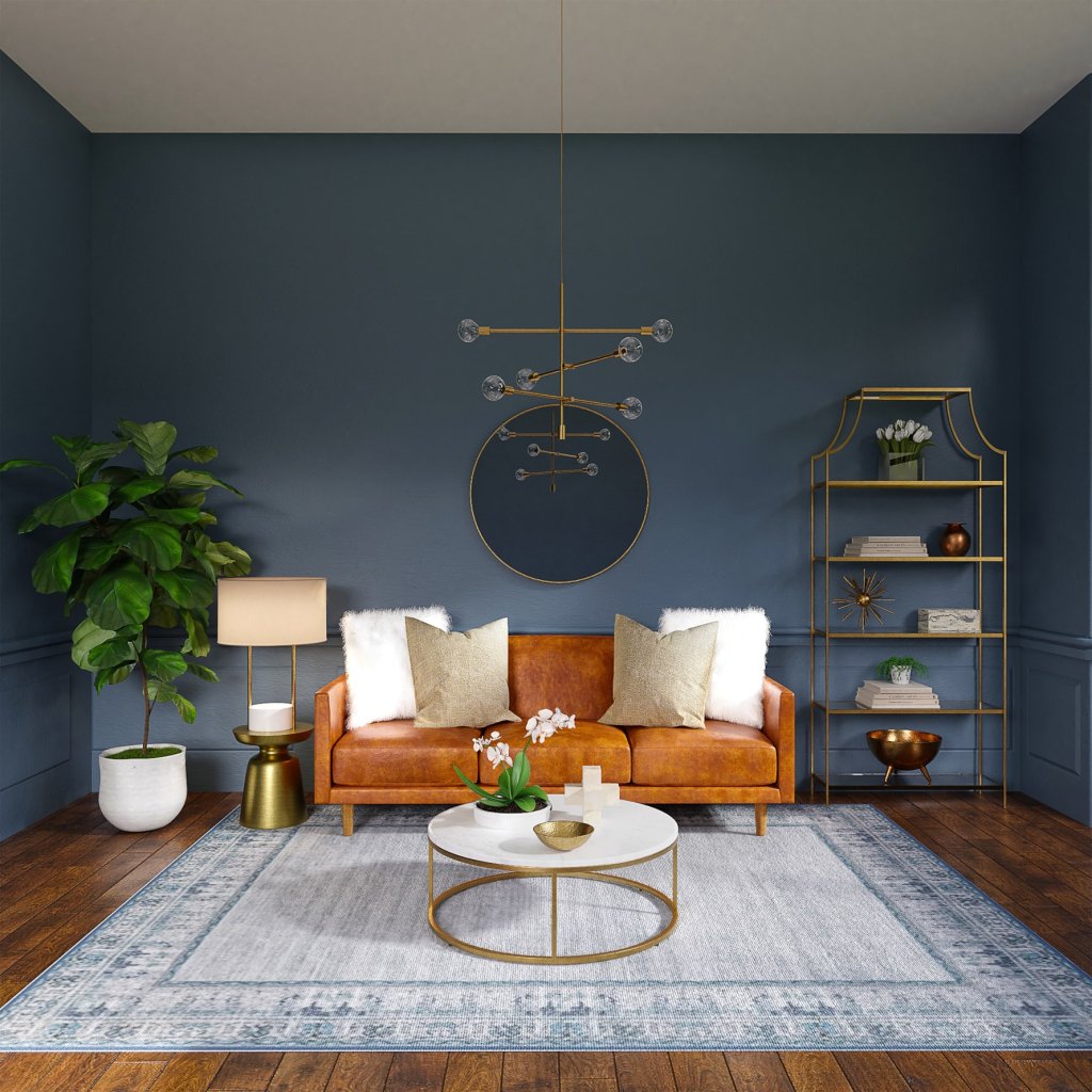
Dark saturated shades, contrary to old stereotypes, will not necessarily visually “devour” the space. Designers are increasingly talking about the fact that saturated shades give the room depth.
When dark walls are combined with light ones, the rich shade seems to push the wall deeper, it seems that it is located further than it actually is. This technique works flawlessly if you make the dark wall smaller in size.
Dark shades are completely capable of blurring boundaries. If you choose related tones for the ceiling and walls, they will visually flow into each other, making it difficult to perceive the true dimensions of the room. Yes, the ceiling does not have to be white either.
And is it really necessary to chase the notorious effect of visual expansion of space? After all, in fact, there will be no more square meters, and the chamber space in saturated rich shades, in the end, may turn out to be more comfortable and more interesting than a white room.
Curtains and tulle – an unbreakable union
Light tulle + thick curtains. This textile tandem is an obligatory component of the apartments of our mothers and grandmothers.
In modern interiors, multi-layered window decoration is increasingly being abandoned. In design projects, there are even completely bare windows, but in an urban environment, where the night can be brighter than the day, and the details of your personal life can be the property of the house opposite, such a technique seems like a utopia. And the sun’s rays, due to which the furniture fades, have not been canceled either.

You can choose the golden mean, abandoning the union of curtains and tulle in favor of curtains alone or practical Roman blinds.
Another tradition is to carry the curtains to the atelier and cut them to the floor level. Is it worth it? In modern interiors, curtains can remain long, lying in dramatic folds on the floor. This length will help visually stretch the room.
Everything is small in a small room
This also applies to wallpaper ornaments and furniture. In fact, a large expressive print will not only not eat up space, but will also take on the role of a point of attraction for the eye, which will distract from the size of the room. The large furniture object works in the same way.
Of course, you should not clutter up a small space with low ceilings with bulky cabinets. But a solid-sized sofa from the Meridian furniture paired with a massive floor lamp will divert all the attention of the viewer to themselves and create the impression that the room is not so small, since such large things fit in it.
The rest of the furniture can remain compact, it is enough to choose one or two items in a large size. But they don’t acquire too many neighbors. Compensate the presence of big furniture with a minimalistic decor that will not create visual noise, and therefore a feeling of tightness.
Imagine a small room furnished with small furniture. Does the space feel larger than this? Or does it seem like a hobbit lives here?
All metals must be selected in the same shade
Another firmly learned interior rule: all metalized surfaces in the room must be uniform, if chrome, then only chrome, if brass, then only brass. Good news: the rule no longer works. Modern designers have canceled it, turning a combination of different shades of metal from bad manners into a fashionable technique.
The same applies to different types of wood in the same room.
The plan must be open
Not so long ago, interior fashion was dominated by the Scandinavian style, which respects light and space, and the American loft, which gravitates towards an industrial scale. Designers actively took up redevelopment in an attempt to adjust the possibilities of the housing stock to fashion trends. They demolished the walls, abandoned the doors, and combined the kitchen with the living room and the loggia with the room. Even the housing stock adjusted and began to offer apartments with the so-called European layout.
Having lived in such conditions, many have come to the conclusion that an open plan is not at all as convenient as one would like to think. Especially if in apartments there are more than two people living there. And if you had to work from home, you quickly start to miss the doors and partitions.
Modern interior design is more focused on smart zoning that provides privacy.
I would like to note that none of the listed items is a crime against interior fashion. Following interior traditions or new trends – it’s up to you.

